|
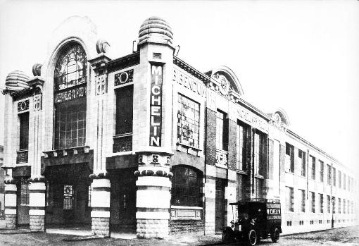
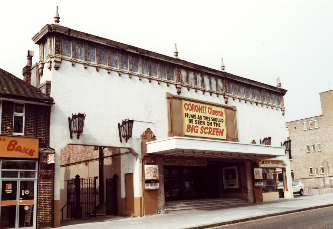
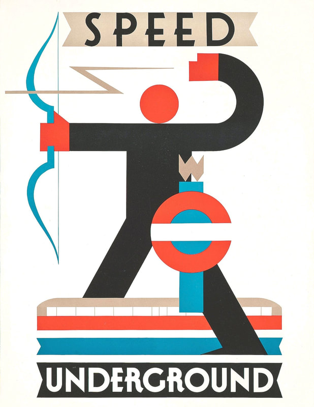
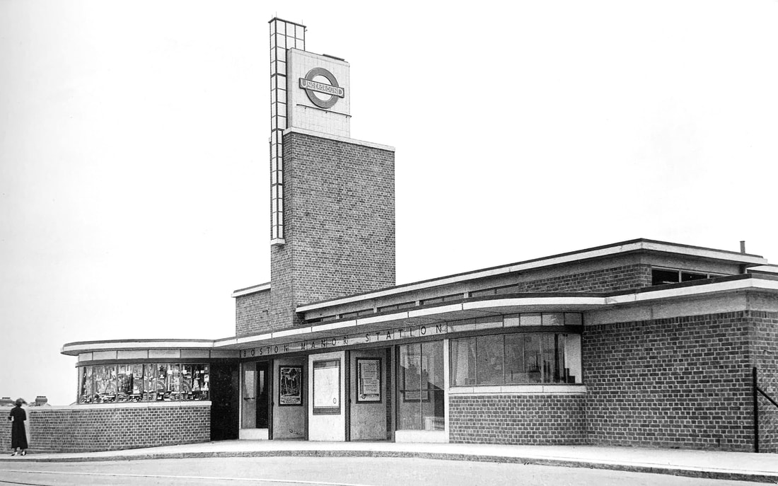
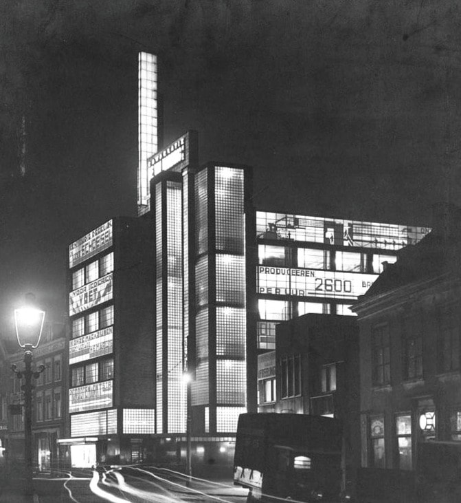
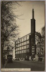
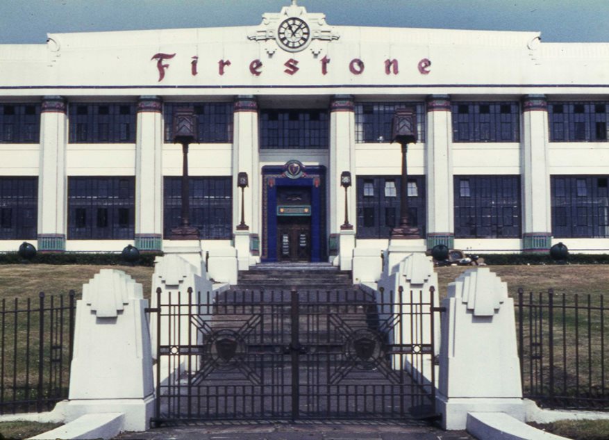
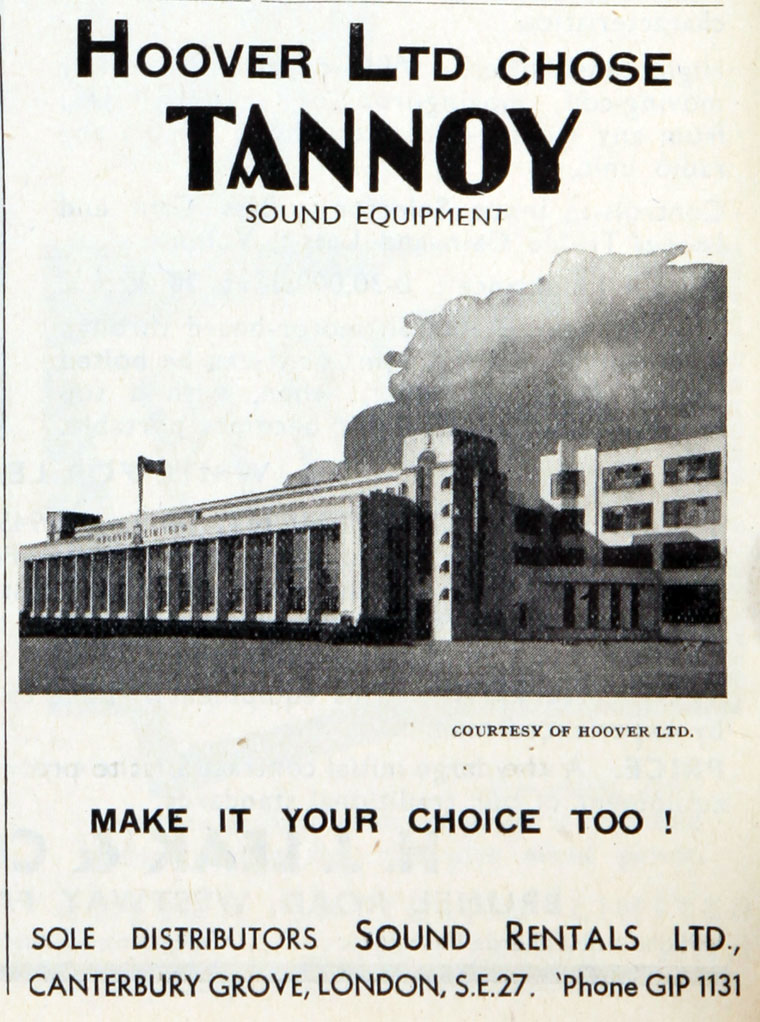
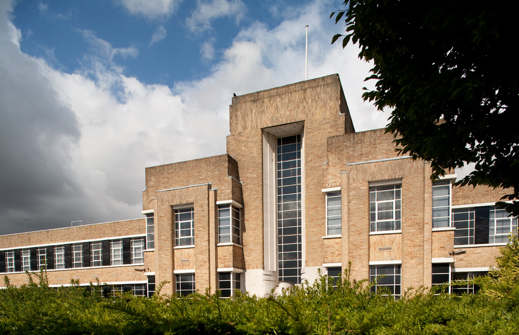
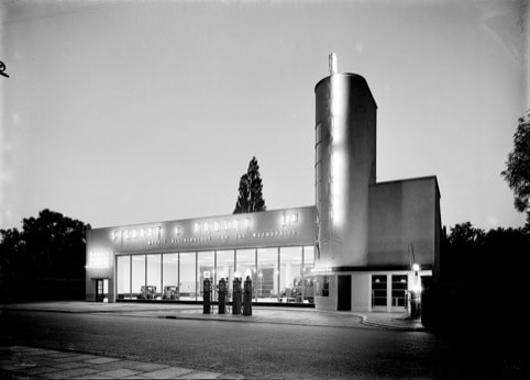
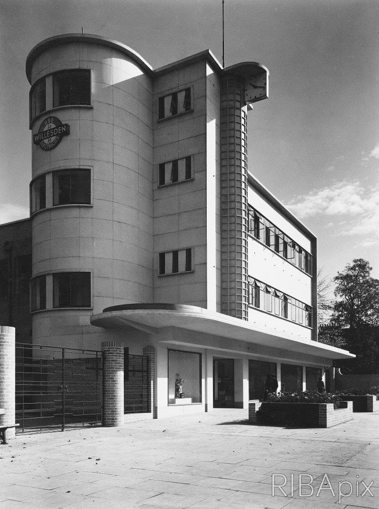
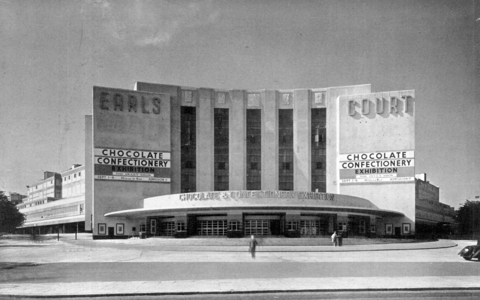
Buildings have always been designed to signify something, whether as temples, cathedral or palaces. But with the advent of electricity buildings could be used to advertise products and services through neon lighting, night and day. We will explore the buildings of the first half of the 20th century, designed with commercial gain in mind, such as Michelen House in Chelsea, completed in 1911 for the tyre firm of the same name. It was designed by Francois Espinasse, and adorned with details relating to cars and bicycles, such as the Michelen Man design. Espinasse was not an architect by training but an engineer, but he understood that the primary function of this building was to advertise. The cinemas of the 1920s and 30s were the epitome of the idea of the building as billboard. Hundreds of screens were built in the Golden age of cinema, for chains such as Odeon, ABC and Gaumont. The cinema architects had to produce increasingly extravagant buildings to attract customers to their particular chain.The designers often went for a theme such as Moorish, as seen at the Ealing Odeon, opposite Northfields station. Designed by Cecil Masey, the cinema opened in September 1932, and was originally called Spanish City Cinema. The exterior has a Spanish style frieze and cornices above the entrance, with whitewashed walls. The interior, designed by Theodore Komisarjevsky, features a tent-like roof, turret style projections and Moorish arches. This style was known as Atmospheric for obvious reasons, and the idea was to immerse the customers in an exotic atmosphere, giving them a total experience. Another example from Ealing is the Himalya Palace in Southall, designed by George Coles, the king of the cinema architects. Coles designed about 90 Cinemas, mostly for the Odeon chain, in a variety of styles. The Himalaya Palace, opened in 1928, is designed as a Chinese Pagoda with a red tiled roof and dragon gargoyles on the outside, and inside with chinese lanterns and decorative plasterwork in red and gold. Away from the Atmospheric style we have the Art Deco or moderne cinema. A great example of this is the Harrow Dominion cinema, designed by Fredrick Bromige and opened in 1936. The building features a magnificent art deco facade, unfortunately covered up since 1962, due to the cost of its upkeep. Plans are underway to uncover and restore the facade as part of a redevelopment into apartments. Bromige also designed the nearby Rayners Lane Grosvenor cinema, which has its streamline facade still uncovered. The frontage has a curving concrete mullion, said to be shaped after an elephant's trunk. Like many cinemas it has now been turned into a church. The next building type we are going to explore is the underground station. In 1915 Charles Holden met Frank Pick, then the commercial director of the Underground Electric Railways Company of London, the forerunner of London Underground. Pick wanted to revolutionize design on the underground network, bringing in a new eye-catching modernist influenced look. Pick wanted the stations to communicate speed, modernity and light. The tube network already had a chief architect, Stanley Heaps, but Pick felt his designs were not modern enough. Holden's first step in bringing modernism to the underground were his designs for eight stations at the southern end of the Northern Line, featuring double height ticket halls clad simply in Portland stone. Holden’s next step was the Piccadilly line stations of the early 30s. With designs such as Sudbury Town and Chiswick Park, Holden managed to balance form and function, allowing passengers to move quickly from the street to the platform or vice versa, using Scandinavian influenced buildings. Holden used basic plans for these stations, usually rectangular or circular. Holden wasn't a modernist ideologue, but recognized that these forms were the most efficient and harmonious for the function of the buildings. Although Holden’s designs were simple in plan, this gave the buildings a recognizable silhouette, when lit up at night. Pick and Holden were impressed by the use of night time lighting on their trip to Europe and decided to implement a similar technique when designing the new Piccadilly line stations. However, Pick had other ideas. By 1934 Pick was CEO of the new London Passenger Transport Board, and wanted to expand the influence of the organization into all forms of travel in the capital. Two new stations were to be built on the Piccadilly Line, near the Great West Road, only 10 years old at that point.The stations, Boston Manor and Osterley, both differed to the design of previous stations in that Pick had pressured Holden to produce something more eye catching rather than being a function of their purpose. Pick wanted the stations to stand out alongside the new road, and attract commuters who might be tempted to travel by car or bus. The desire to attract attention can be seen in the design of the stations. Gone are the open ticket hall designs of Sudbury Town and Chiswick Park, replaced by low, squat buildings with tall, eye catching towers. These towers look rather like the towers on two buildings that Pick and Holden visited during a European tour in 1930, The Volharding Building in the Hague and De Telegraaf Building in Amsterdam.The Volharding building was specifically designed to allow as much advertising space as possible on the outside of the building. It was illuminated at night allowing for 24 hour adverts. The lighting of buildings in Europe impressed Pick and Holden on their 1930 trip, and they imported this idea when designing the Piccadilly Line stations of the 30s. The pressure to design more eye catching stations did cause a slight rift between Pick and Holden, which was exacerbated by Holden’s preoccupation with his University of London work which kept him busy for the rest of the 30s. Another station, not by Holden, but by Herbert Welch and Felix Lander also shows a similar design to Boston Manor and Osterley. Park Royal station was opened in 1936, alongside Western Avenue in Ealing, and repeats the low ticket hall building, offset by a tall, eye catching tower. Wallis, Gilbert & Partners were the pre-eminent factory designers of the interwar years. Established by Thomas Wallis in 1916, the practice produced a wave of factories, becoming more extravagant in design as the 1920’s became the 1930’s. The building that brought them to the attention of the architectural and wider world was the Firestone Factory on the Great West Road in Brentford. Completed in 1928, the art deco office building which fronted on to the road, quickly became the symbol of Firestone in Britain. Behind this facade was the actual, more down to earth production buildings, which were nevertheless meticulously planned out for the most efficient use of space and time. The factory was famously demolished on August Bank Holiday weekend 1930, as the papers to save it, sat in an in-tray at the Department of the Environment. A few years after the Firestone factory, the practice would begin work on maybe their most famous building, the Hoover Factory at Perivale. Situated like the Firestone building, along one of the new arterial roads running into London, the factory became the symbol of the Hoover brand, projecting modernity and aspiration. Again like the Firestone building, the main administration block faces Western Avenue, with the production buildings behind. The 220ft long building has generous glazing, is decorated with colored tiles and also features Erich Mendelsohn influenced towers at each end. The Hoover factory did not just advertise its wares to the road in front, but also to the train line at the rear with a neon sign of the slogan “Beats as it sweeps as it cleans”. The building was also used in posters and adverts for the Hoover brand. Buildings like the Hoover Factory and Firestone building were designed not to be seen from a fixed point, but as Joan Skinner says in her book on Wallis, Gilbert & Partners, viewed by “A young man on his motorcycle and the flapper on the pillion” speeding past. These buildings were meant to be assessed in horizontal motion, with the rhythm of stripes, squares, glasswork and render altering as you change speed and your position to the building along the road. The flashy style of the building led to it being derided by some architectural critics. Nikolas Pevsner famously called it “ perhaps the most offensive of the modernistic atrocities along this road typical of the by-pass factories”. Thomas Wallis was quite honest about the commercial aspect of his designs, telling the RIBA in 1933 that “ A little money spent on something to focus the attention of the public is not money wasted but a good advertisement”. Not every Wallis, Gilbert & Partners factory was quite as extravagant, sometimes the client did not want a billboard for a building. Many of these buildings have now been converted into apartments. Of course cinemas, tube stations and factories were not the only 1930s buildings to act as billboards for their services. Garages, showrooms and shops all tried to grab the attention of the passersby. Stuart Cameron Kirby designed a range of moderne car showrooms, such as this one in Staines. They were designed for Stewart and Arden, exclusive dealers for Morris cars in London. They set up their showrooms on the new roads into London, away from the traditional car showroom areas of Great Portland St and Piccadilly. The buildings had long plate glass windows, illuminated at night to show threat cars to passing motorists. Electricity Showrooms proliferated across the capital in the 1930s, as electricity replaced gas as the main power source. The new showrooms were designed to showcase the various electrical appliances, like radios, televisions and kettles. The shops were designed in a futuristic style, all glistening chrome and shiny glass. Even priests of high modernism such as Walter Gropius and Maxwell Fry were persuaded to design such buildings, as can still be seen at their shop in Cannon St, now a noodle bar. Other high street shops adopted the futuristic look, fitted out in vitro lite glass and adorned in neon. One of the most famous examples is the HMV store on Oxford St from 1939 by Joseph Emberton, with its black granite and neon exterior. The new exhibition centre buildings of the 30s were also intended as giant billboards, letting passerby’s know which convention or exhibition there were hosting. Emberton designed the new hall for the Olympia centre in 1929, with its monumental streamline facade. The other famous west London exhibition centre, Earls Court was opened in 1937, with its giant concrete framed frontage able to accommodate eye catching signs.
The 1920s and 30s were the time that modernism and art deco (slowly) made its impact on Britain. It was also an era of expanded commercialisation, where advertising and what we call today “branding” started to make its way into the cityscape. These two strands combined, and have helped shape the Britain we live in today.
2 Comments
Mike
28/1/2021 01:06:31 pm
Been following the Twitter account for ages but first time I’ve ventured into the blog. A terrific read, will definitely be a returning visitor, well done.
Reply
Leave a Reply. |
Archives
May 2024
Categories |
 RSS Feed